


The creative process behind a book cover
A long and winding road

I’m Hanna Thomas Uose, a writer and a strategist for the progressive movement. Here I share what I’ve been thinking about (mainly how to make a new world and how we are with each other while we do it). Every quarter, I also send a list of things I’ve enjoyed. Take what you like and leave the rest.
Hello, thanks to those who have said such nice words about my posts on why I wrote Who Wants to Live Forever (out in two weeks!) and how I wrote it. I love that you have loved following the journey!
Next up, I am sharing the story of the book cover and specifically the process that Brazen’s genius designer, Mel Four, went through to land on the final version. As I look through these, I am so bowled over by all the work that goes into a book that has nothing to do with the author. So much thoughtfulness, invention and perseverance. Shout out to all the designers, marketers and publicists, printers and booksellers and everyone in between. Publishing is one of those idealised industries which is, I suspect, sometimes quite brutal to work within. So I am ever grateful to all those who have worked so hard for this book.
This will be told in Mel’s words! The only thing you need to know is that she references the fictional drug Yareta, which I named after the very long-living, neon-green plant of the same name…

... with that, over to Mel.
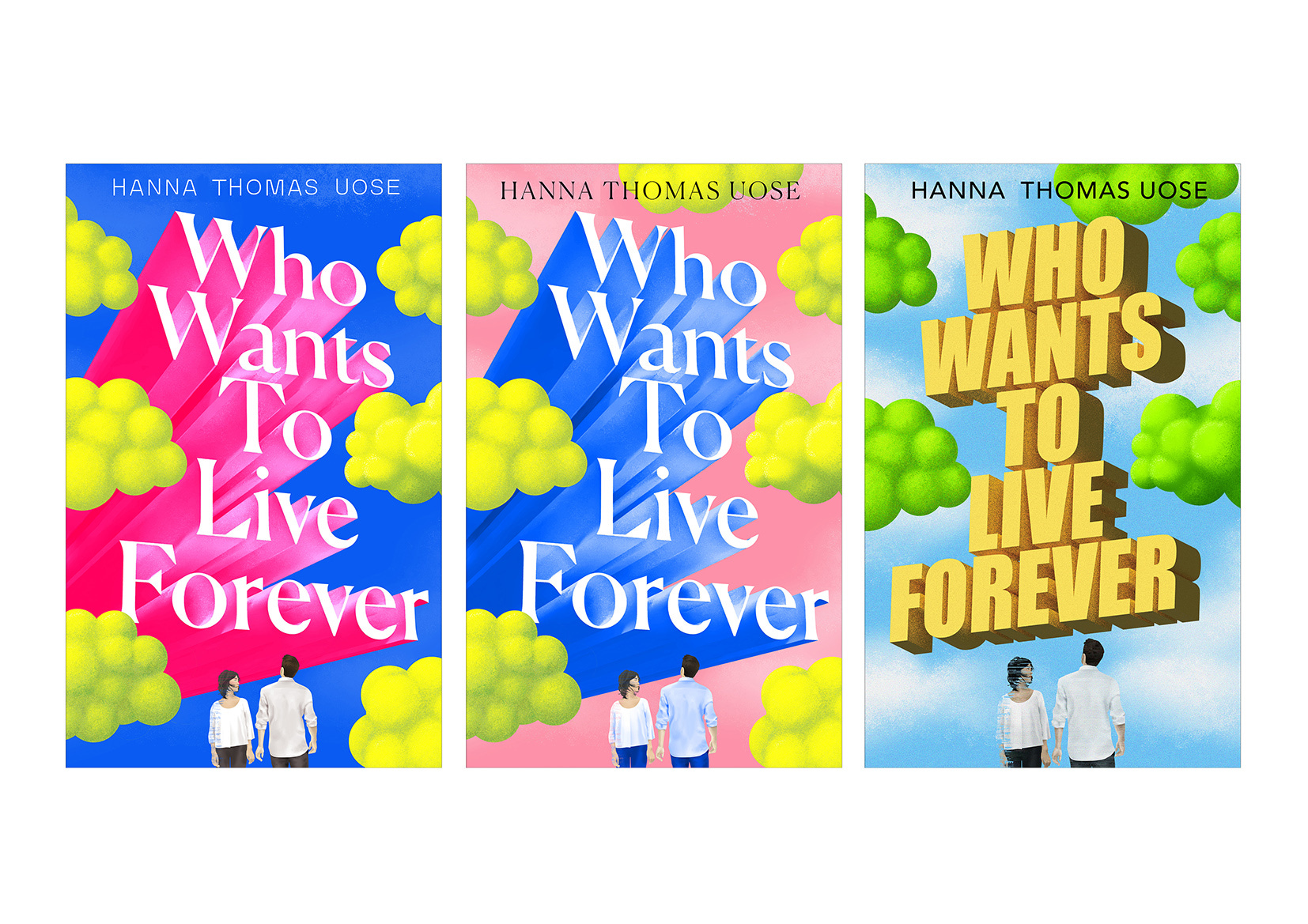
This novel is so rich with ideas, a big challenge for the cover design was to decide what we should be focusing on.
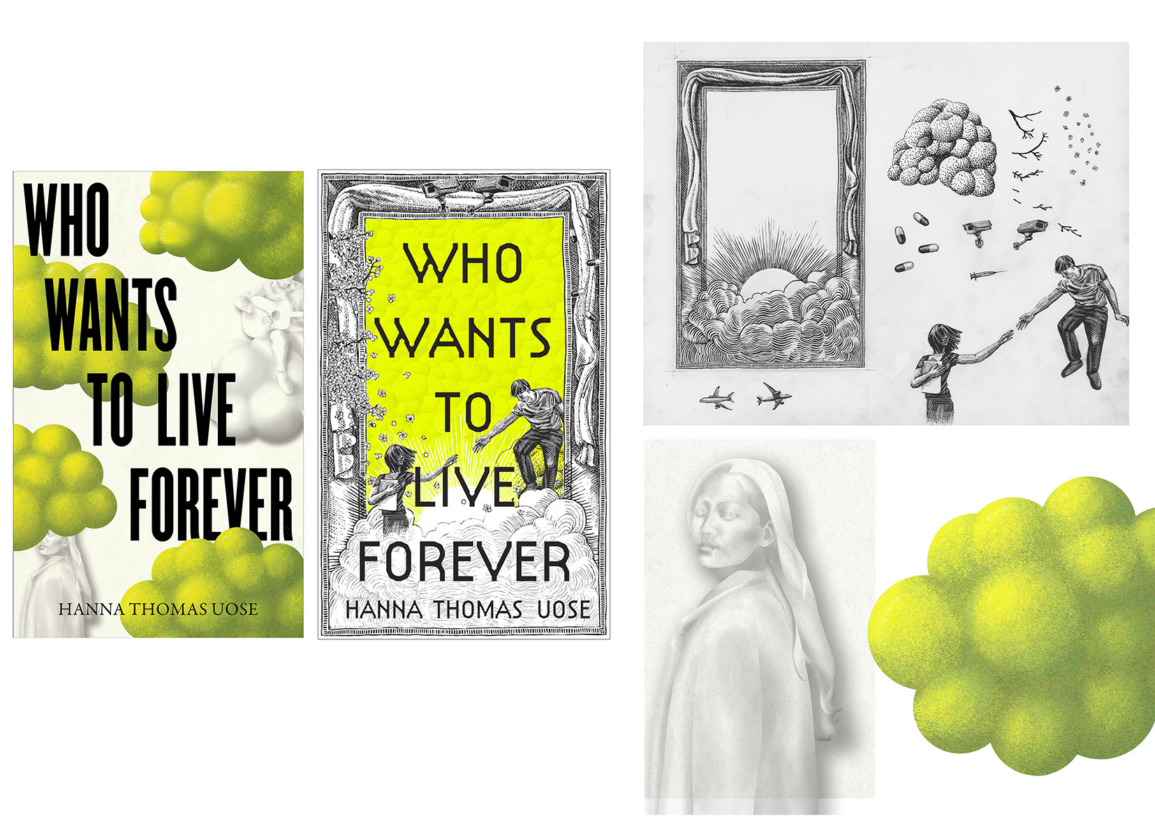
For the holding cover I was thinking about the central love story, technology and Yareta.
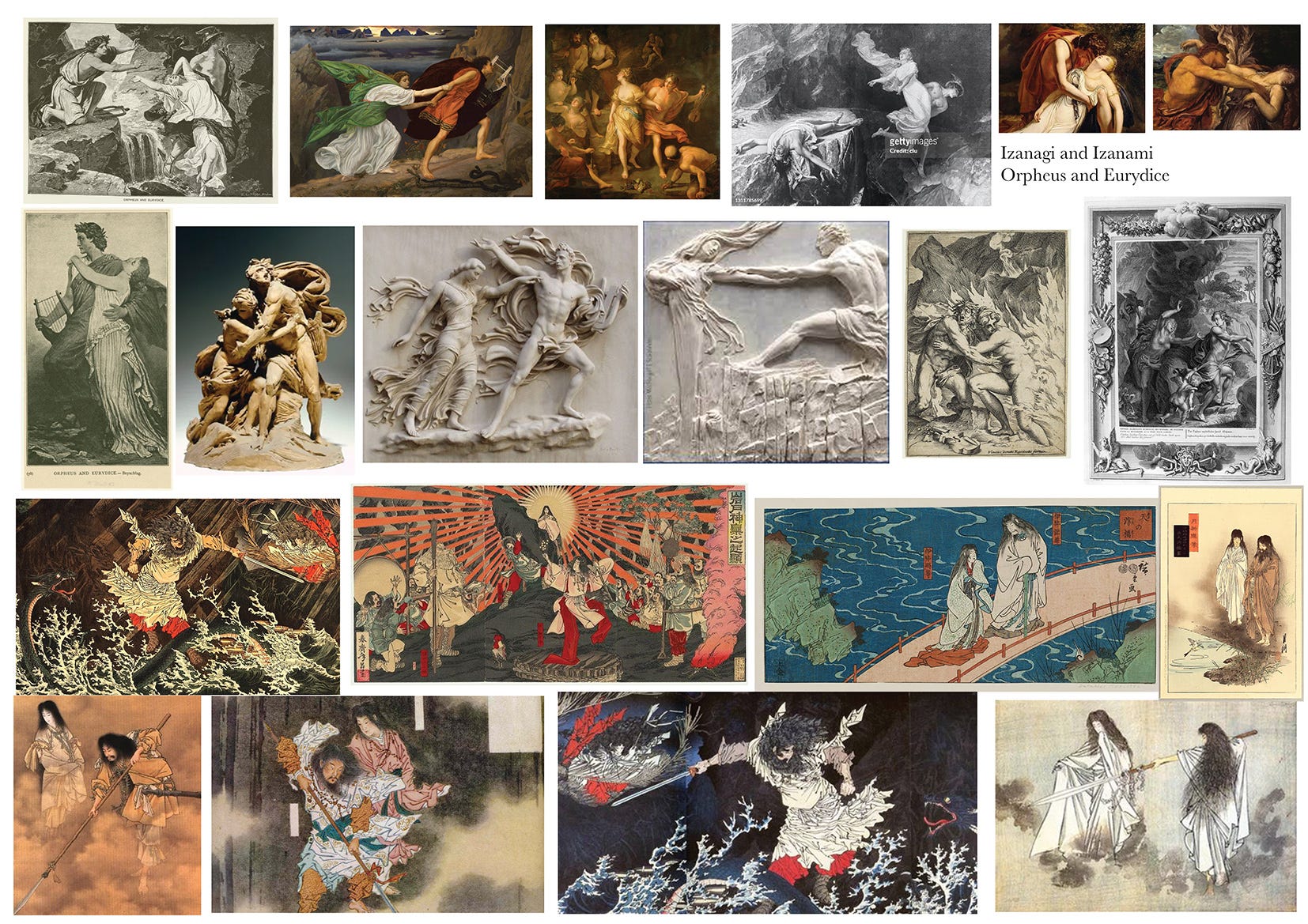
For the actual cover, we began by thinking about Izanagi and Izanami (deities from Japanese mythology who are referenced in the book) – their story is similar to Orpheus and Eurydice.
The big themes of mortality / immortality, men playing god and big moral choices are central to these myths and Who Wants to Live Forever.
We talked about creating some kind of modern twist on a classic relief carving or print to hint at the timeless / epic issues tackled in the book.
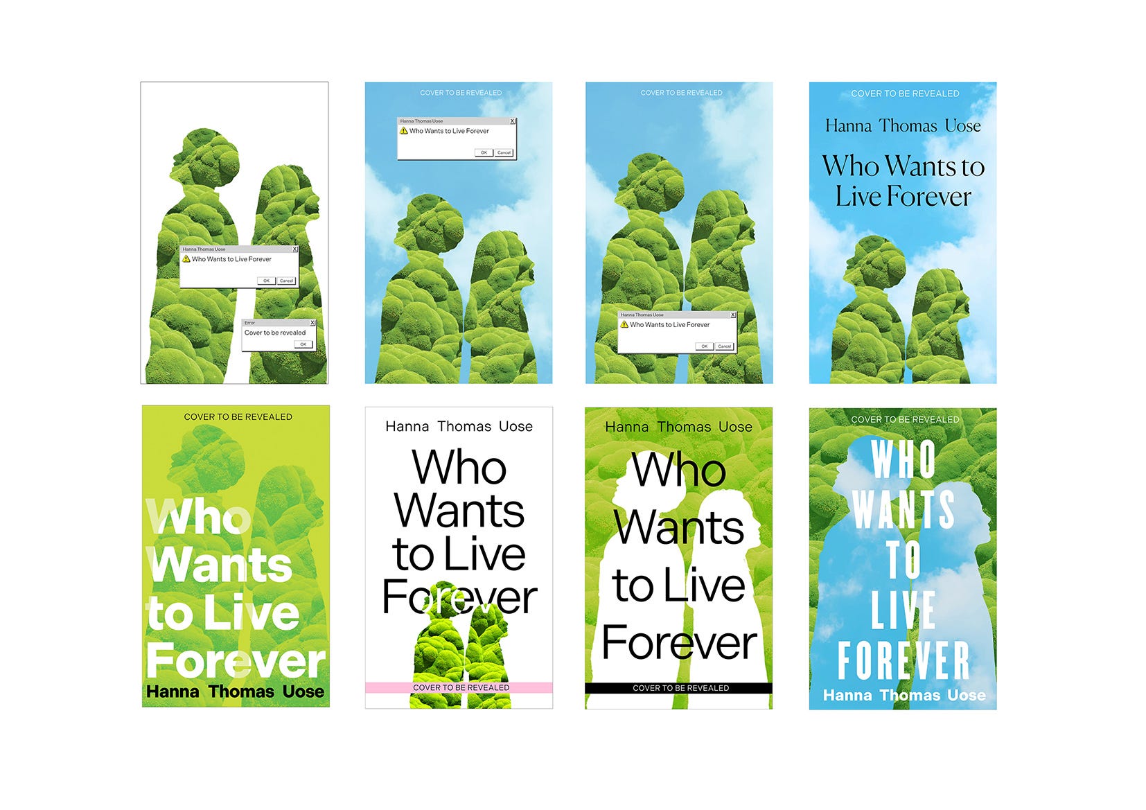
Early visuals playing with a modern take on stone carving or etching, featuring Yuki and Sam. I tried creating an etching with aspects from the book. These cover designs were feeling too complicated and not arresting enough, and felt too historical.
We did keep the idea of ‘almost but not quite’ interaction between Yuki and Sam in following visuals.
I moved on to a much simpler approach, making the most of the great title, keeping Yareta ‘clouds’ and Yuki and Sam with their hands almost touching. This time they’re facing in different directions to show their different choices. Yuki slightly fading out, there’s some static interference laid over her as a portent of what’s to come. These visuals didn’t feel special enough, we wanted our cover to have more of a unique identity.
With these visuals I was trying to develop the previous visuals into something more impactful and interesting. Still focusing on the title and love story, thinking more about the different paths Sam and Yuki take. These were the first designs we shared with our sales and marketing teams in our covers meeting. We agreed to develop the idea but perhaps try bringing the couple up (make more of the relationship) and make sure the cover didn’t look too young.
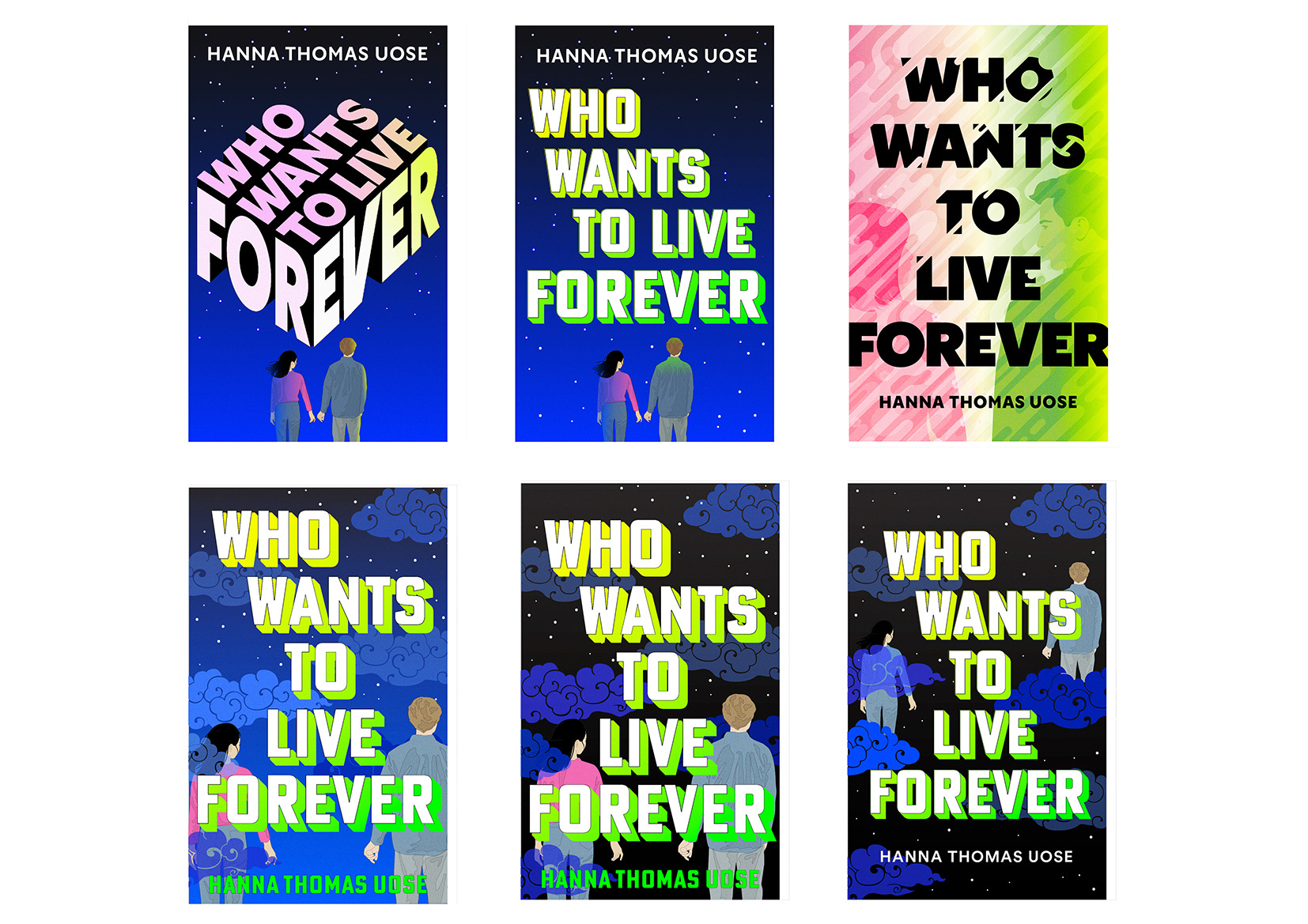
I concentrated on the idea that Yuki and Sam are on different planes, they are almost touching but never will.
We felt like these were looking too much like Young Adult fiction and I realised it was probably the way I was depicting the couple, and the colour palette.
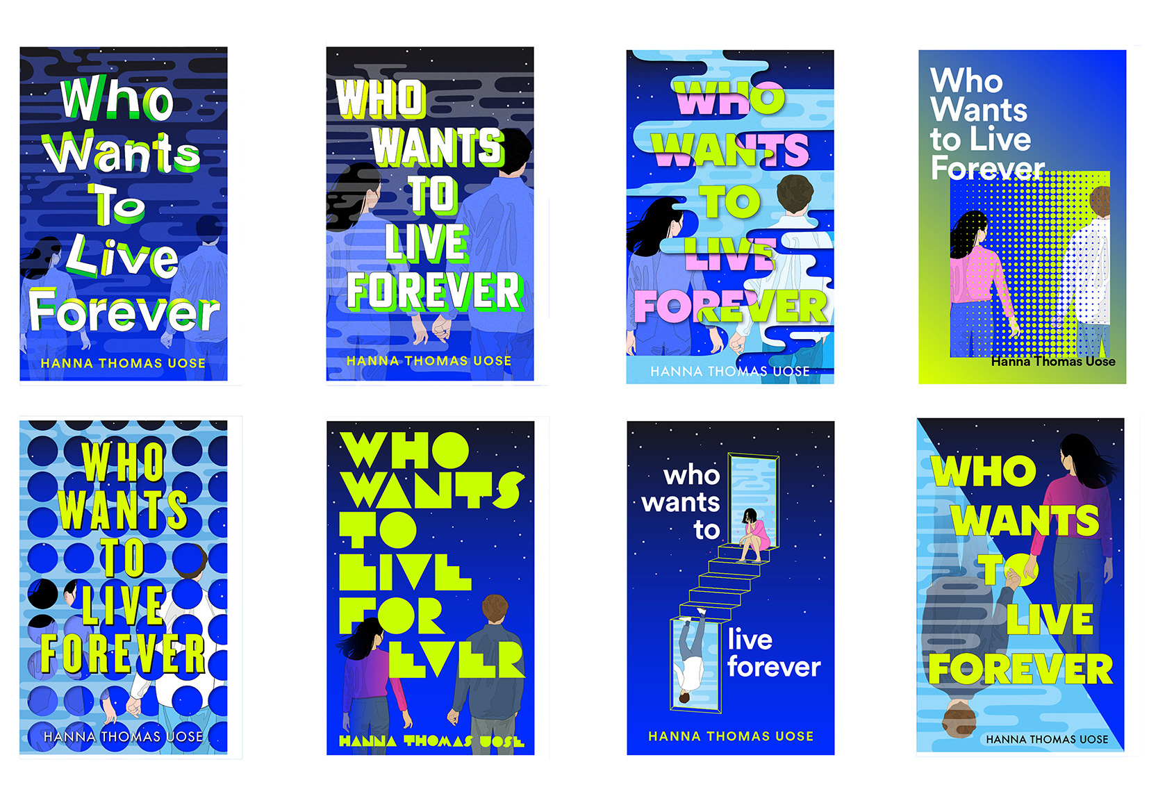
I needed to rethink the cover, making sure it had its own unique identity. Still focusing on the themes of two different realities within a love story.
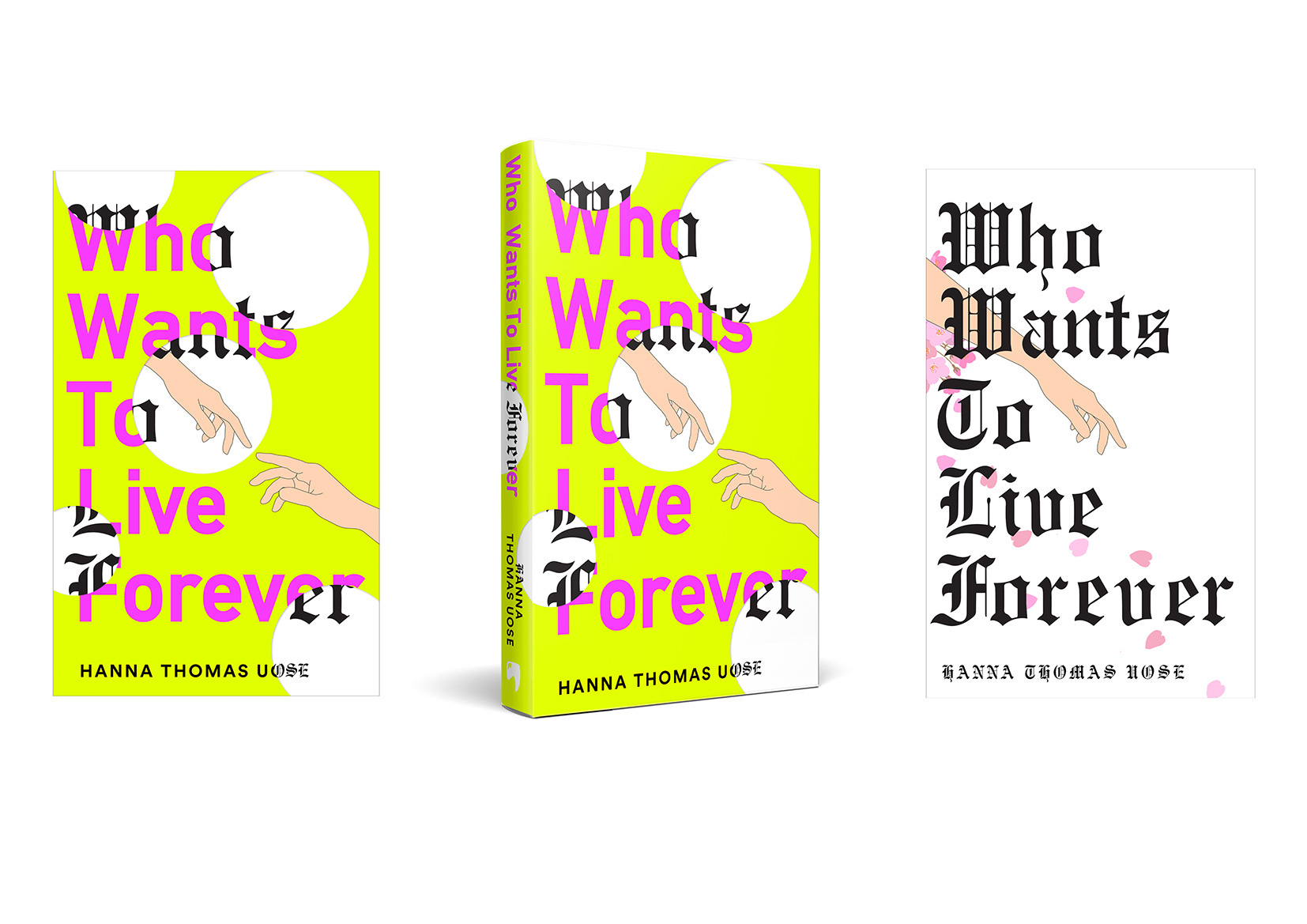
Visual 3 was chosen for its simplicity and impact.
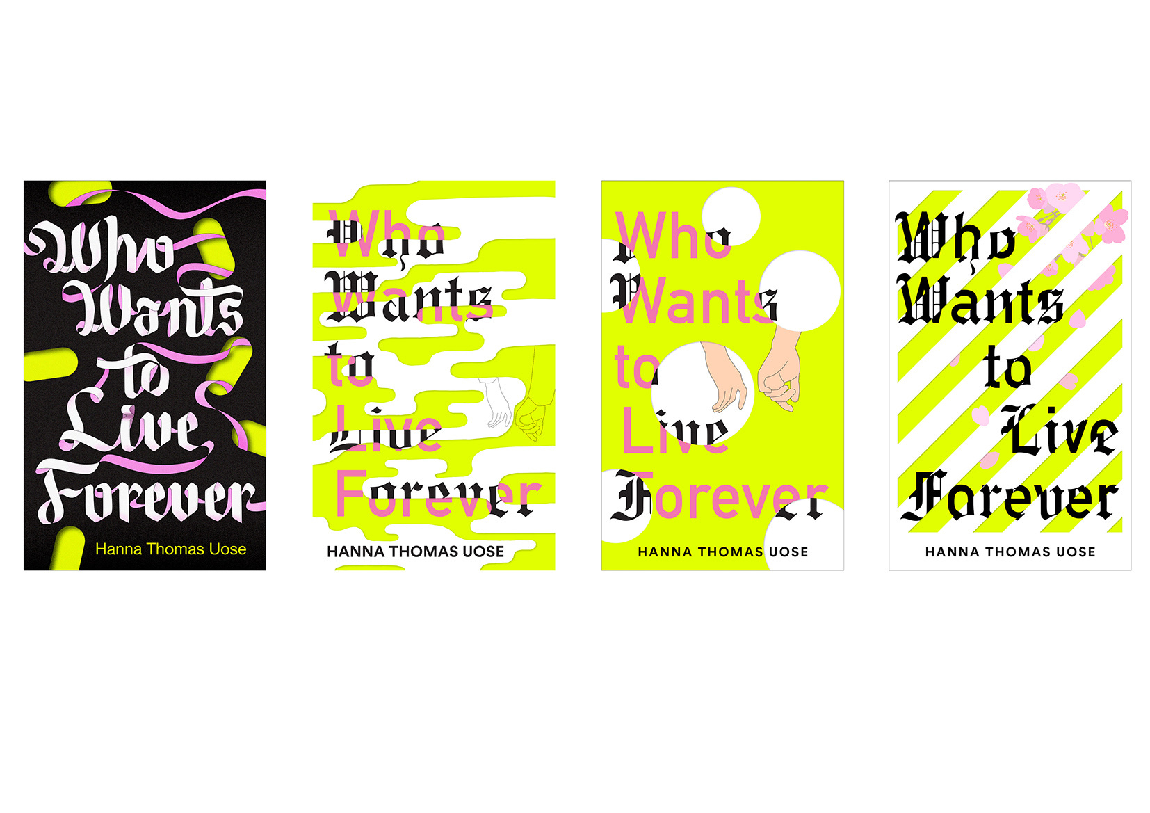
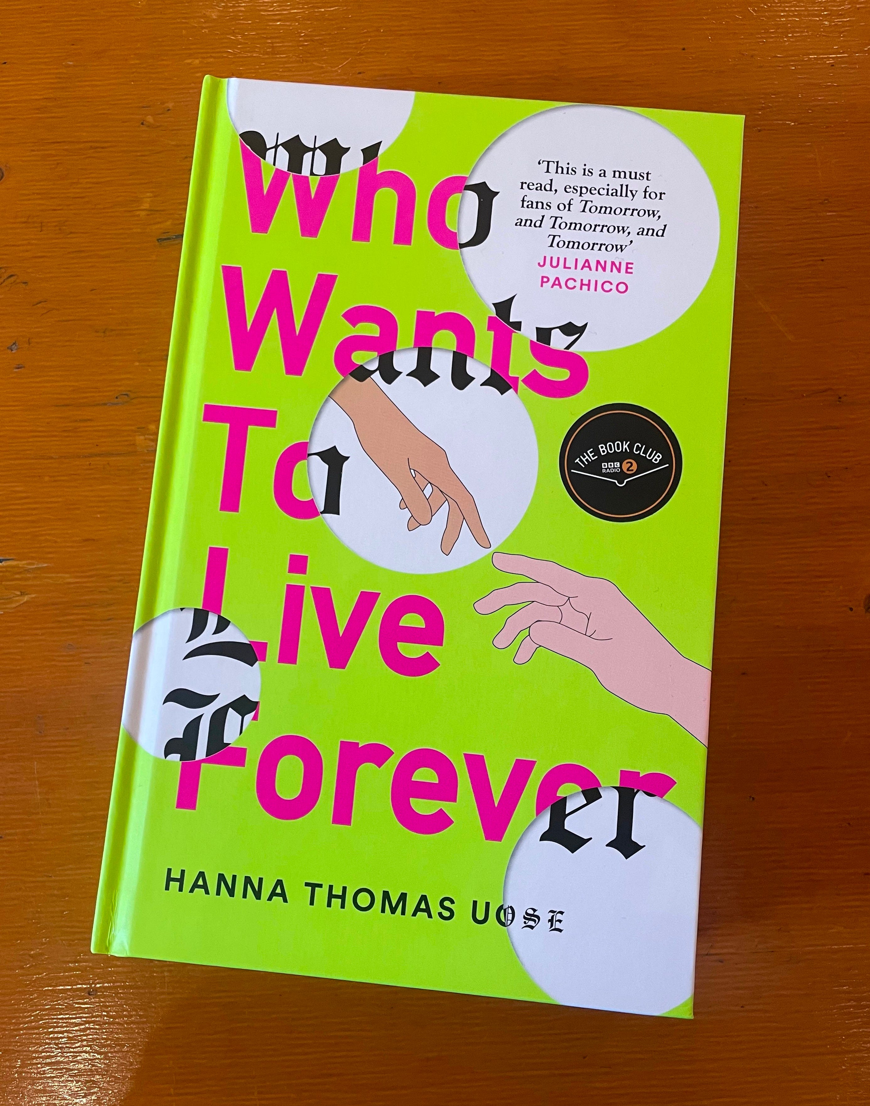
The Final Cover! Sam’s hand is on the neon green (for Yareta) outer cover and Yuki is on the inner cover with cherry blossom.
Sam representing technology and Yuki nature, they are reaching for each other (with reference to The Creation of Adam) but can never touch.
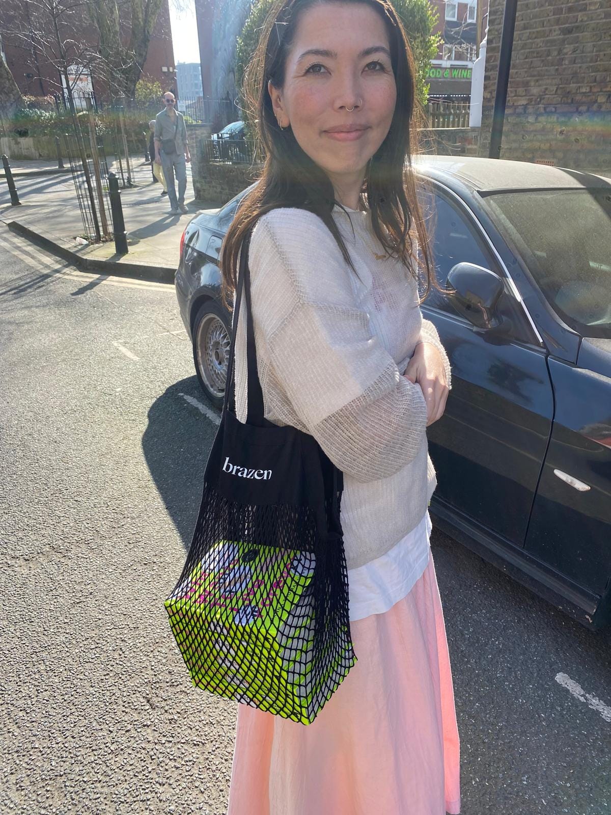
Hanna again – I feel so extremely lucky that I am in love with the final book cover and I do not take this for granted! Here’s a pic of me gallivanting around town with a few finished copies (and not just for show, it was a real true errand).
There is still time to pre-order from lots of good places! And just a reminder that I am running a free online writing workshop in return for pre-orders on Saturday March 22nd (or you can receive the recording). More details here!
I am also going on book tour! I would love to see your faces in London, Oxford, Edinburgh, Folkestone, Canterbury, Manchester, Norwich or Surrey.

That is more than enough for now.
Much love and solidarity over the web waves,
Hanna
Hey, friend! I rarely discuss my day job but work as an advertising copywriter, so the brief, the feedback, the rounds, and nerdy minutiae of this was brilliant. Can’t wait to see you along your tour and celebrate you properly. xx